Sometimes appearances can be deceptive.
Here's an image from the 2013 report of the Intergovernmental Panel on Climate Change (IPCC AR5) (part of Figure TS.12 from the Technical Summary):
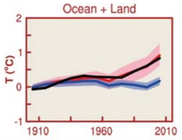
It shows the observed temperature change (black), along with the temperature from various scientific models of the climate. Some models include contributions to climate change from human activity (pink shading, with the "average" given by the dark red line), and some models consider only natural contributions (light blue shading, with the "average" given by the dark blue line).
Now here's the optical illusion part.
- Note how the black line appears to be going up to the right. This is an optical illusion. In fact, the black line is pretty much horizontal, which shows that global warming isn't happening.
- Note how the black line appears to be nowhere near the blue shaded area. This is an optical illusion. In fact, the black line is very close to the blue shaded area, which shows that most of the change in global temperatures can be explained by natural causes.
- Note how the pink shaded area appears to be closer to the black line than the blue shaded area is. This is an optical illusion. In fact, the pink shaded area is no closer to the black line than the blue shaded area is, which shows that human activity is not a significant contributor to the change in global temperatures.
It takes practice, but with enough will-power and enough squinting, you should be able to convince yourself that anthropogenic global warming is just an illusion. Go on, give it a try!